
Ballotics: Elections, Politics
Ballotics: Elections, Politics generates an estimated $700–$13k/month in revenue from 500–2k downloads/month on the App Store, according to AppCurrents estimates (updated 2026-10-02).
| Est. revenue / month | $700–$13k |
|---|---|
| Est. downloads / month | 500–2k |
| Estimate confidence | medium |
| Pricing | Paid $3.99 |
| Rating | 4.43 ★ (30 ratings) |
| Category | News |
| Best chart rank | #35 News Paid |
| Released | 02.10.2020 |
| App last updated | 25.06.2026 |
| Platform | iOS |
Modeled monthly estimate · rating velocity · medium confidence



About
Ballotics: Election Data & Map The numbers behind American democracy — beautifully presented. Ballotics 3.0 is a complete redesign. Cleaner. Deeper. More honest about what the data actually says. Whether you're tracking the 2026 midterms, replaying history back to 1788, or building your own 2028 electoral scenario, Ballotics gives you the tools serious observers use — without the spin. WHAT'S NE…
Trends & analysis
Chart rank trend
US · categoryWhy it's surfacing
Scout 16Ratings & velocity
★ -0.02 in windowRating distribution
87% positive · 31 ratingsGeographic reach
best rank · 1 storefrontRevenue & downloads trend
ARPU $3Update history
2 updates tracked- v3.03mo ago
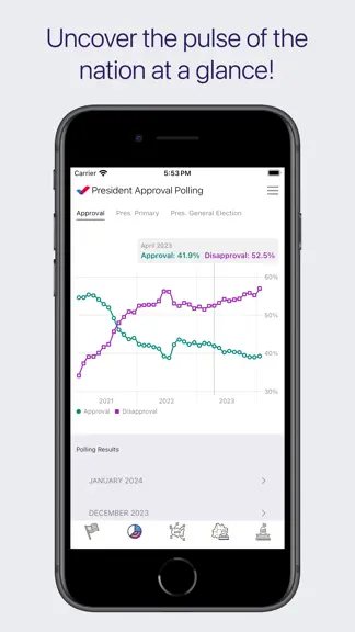
VERSION 3.0 — THE REDESIGN DESIGN The entire app has been rebuilt with a new editorial aesthetic — data journalism, not dashboard software. Two typefaces define the look: Fraunces (a variable serif) for display text and big numbers, JetBrains Mono for every data label and statistic. The palette is warm and deliberate — ink on parchment, crimson for Republican, navy for Democrat, ochre for tossups — consistent across every screen. Every screen is organized around information hierarchy, not chrome. Cards are sized by importance. Sparklines use Swift Charts with monotone interpolation. The election map runs on Canvas with hardware-accelerated CGPath rendering and a geometry cache that eliminates per-frame recalculation. iPad layouts expand into wide two-column arrangements; the data never just scales up — it reorganizes. FEC FINANCE — ELECTIONS A Money view now sits alongside Results and Counties for every election 2000–2026. A state choropleth maps fundraising geography using a diverging color scale — light to fully saturated party color — so winner and margin read simultaneously. Hero fundraising cards show total raised, cash on hand, burn rate, and itemized donor count for the top candidates. A full per-state receipts table below, sourced directly from OpenFEC Schedule A filings. FEC FINANCE — MEMBER PROFILES Every member of Congress has a new Fundraising tab: total raised, spent, cash on hand, and last report filed — plus a source breakdown across individual donors, small-dollar contributions, party committees, and PACs. Below that: top 12 individual donors with employer and occupation, top 12 PAC contributions, and top 12 campaign disbursements. All cached locally so repeat visits are instant. CONGRESS — MEMBER PROFILES Profiles now have three content tabs. Legislation: sponsored and cosponsored bills with policy area, introduced date, latest action, and a link to the bill text. Voting Record: the member's recent roll-call votes and results. Committees: full and subcommittee assignments, live from the data sync. The profile header shows leadership role as a badge, senate seniority (Senior or Junior Senator), and senate class. CONGRESS — CHAMBER VIEW Live seat counts by party, a majority threshold bar, and an interactive floor map or geographic district map for both chambers. Leadership is pinned at the top of every member list — Speaker, Majority and Minority Leaders, and Whips are never buried alphabetically. COUNTY MAPS Three render modes for every county map. Fill uses a custom diverging color ramp — light pink to deep crimson for Republican, light blue to deep navy for Democrat — where intensity encodes margin strength directly, not a flat party fill. Dot scales each county circle by total votes cast so population weight reads correctly: Los Angeles is larger than Wyoming, as it should be. Shift overlays directional triangles showing how each county moved relative to the prior election. Census mode layers ACS demographic data directly over the results — median household income, college education rates, population, and median age, from 2023 ACS 5-year estimates. See not just how a county voted, but what kind of place it is. POLLING & OTHER IMPROVEMENTS Full 2026 midterms polling hub: live nightly averages for Senate, House, and Governor races with margin charts, heat maps, and poll tables. Presidential approval screen shows 30-day rolling averages, individual poll breakdowns by pollster, historical approval arcs across multiple administrations, the 2024 polling arc, and the generic ballot. The 2028 map now includes a Contingent Election explorer for 269–269 ties. Scenario library rebuilt with named saves and swipe-to-delete. Election year selector is now a color-coded timeline bar. Ballotics (ba·luht·tiks). Read the numbers, not the noise.
- v2.3.19mo ago
Bug Fixes.
Ballotics: Elections, Politics — FAQ
How much money does Ballotics: Elections, Politics make?
According to AppCurrents estimates, Ballotics: Elections, Politics generates approximately $700–$13k per month (medium confidence), modeled from its the App Store chart performance, rating velocity, and monetization signals.
How many downloads does Ballotics: Elections, Politics get?
Ballotics: Elections, Politics sees an estimated 500–2k downloads per month on the App Store, per AppCurrents modeling.
Is Ballotics: Elections, Politics free?
Ballotics: Elections, Politics is a paid app priced at $3.99 on the App Store.
What is Ballotics: Elections, Politics's rating?
Ballotics: Elections, Politics holds a 4.43-star average from 30 ratings on the App Store. It currently ranks #35 on the News paid chart.
When was Ballotics: Elections, Politics released?
Ballotics: Elections, Politics launched on the App Store on 02.10.2020. Its latest version shipped 25.06.2026.


